Chapter 6 Exploring a variable pair
Up to this point, we have focused entirely on how to construct descriptive statistics for a single variable. What we have not done is talk about how to describe the relationships between variables in the data. To do that, we want to talk mainly about the correlation between variables. But first, we need some data.
After watching the AFL data, let’s turn to a topic close to every parent’s heart: sleep. The following data set (parenthood.csv) is fictitious but based on real events. Suppose we’re curious to determine how much a baby’s sleeping habits affect the parent’s mood. Let’s say we can rate parent grumpiness very precisely on a scale from 0 (not at all grumpy) to 100 (very, very grumpy). And let’s also assume that we’ve been measuring parent grumpiness, parent sleeping patterns, and the baby’s sleeping patterns for 100 days.
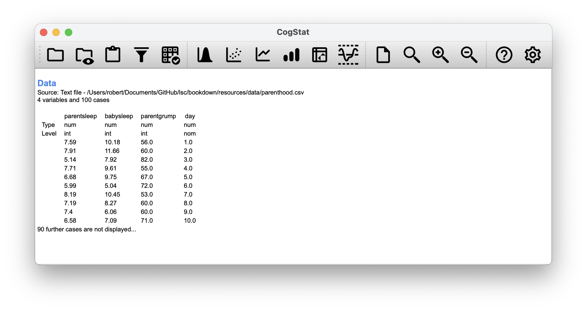
Figure 6.1: This is what you would see after loading the parenthood.csv dataset.
As described in Chapter 5, we can get all the necessary descriptive statistics for all the variables: parentsleep, babysleep and grumpiness. Let’s summarise all these into a neat little table (Table 6.1).
parentgrump
|
parentsleep
|
babysleep
|
|
|---|---|---|---|
| Mean | 63.7 | 6.965 | 8.049 |
| Standard deviation | 10 | 1.011 | 2.064 |
| Skewness | 0.4 | -0.296 | -0.024 |
| Kurtosis | 0 | -0.649 | -0.613 |
| Range | 50 | 4.16 | 8.82 |
| Maximum | 91 | 9 | 12.07 |
| Upper quartile | 71 | 7.74 | 9.635 |
| Median | 62 | 7.03 | 7.95 |
| Lower quartile | 57 | 6.292 | 6.425 |
| Minimum | 41 | 4.84 | 3.25 |
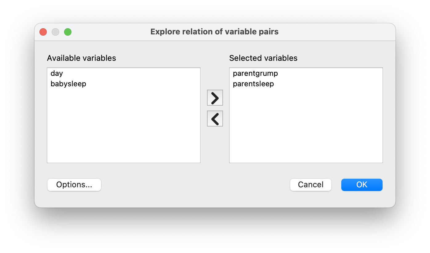
To start understanding the relationship between a pair of variables, select Explore relation of variable pair so a pop-up appears. Move the name of the two variables you wish to analyse from Available variables to Selected variables, then click OK. In CogStat, we can run analysis on multiple variables at once by selecting them in the variable list. This will display all analysis results after each other sequentially. We’ll be looking at sections called Sample properties from the result sets.
6.1 The strength and direction of a relationship
We can draw scatterplots to give us a general sense of how closely related two variables are. Ideally, though, we might want to say a bit more about it than that. For instance, let’s compare the relationship between parentsleep and parentgrump with that between babysleep and parentgrump (Figure 6.2).
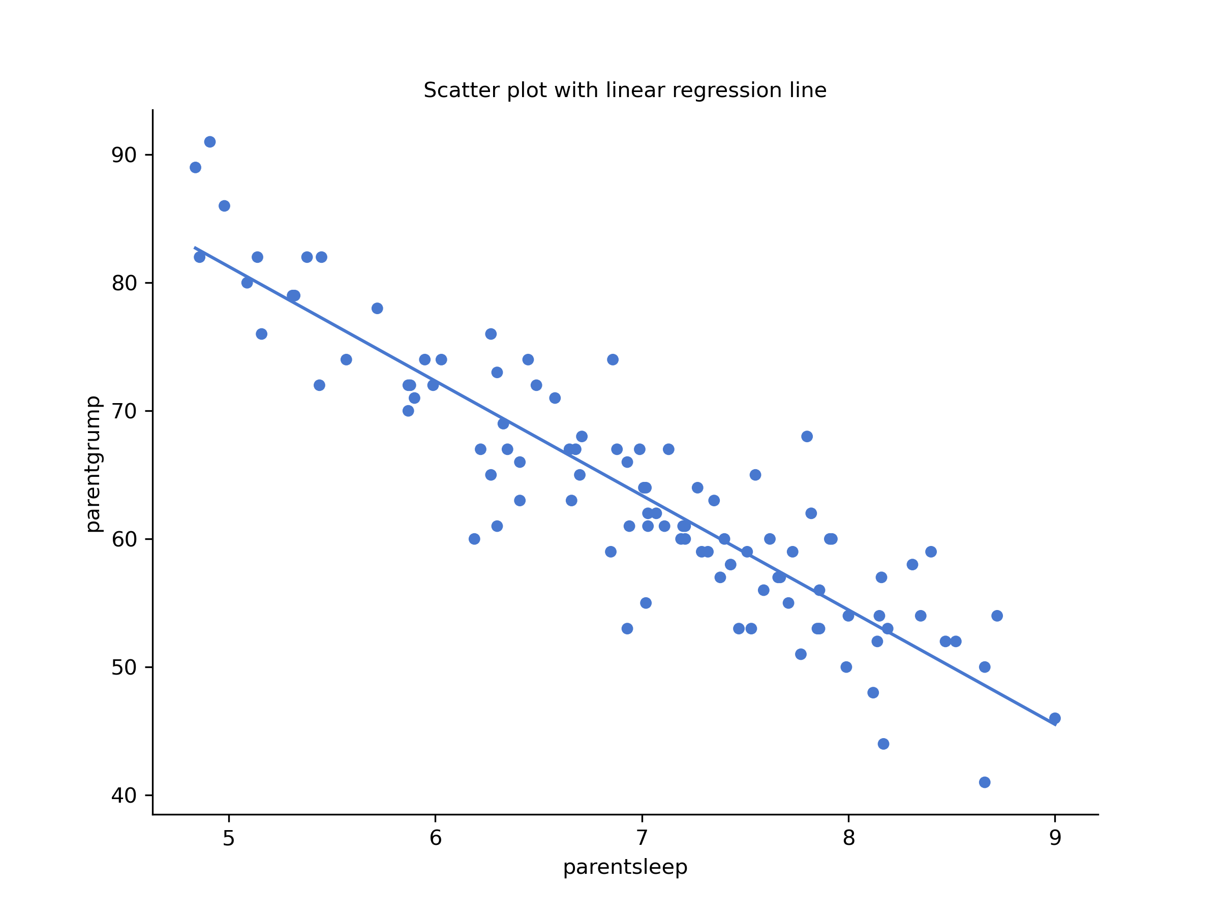
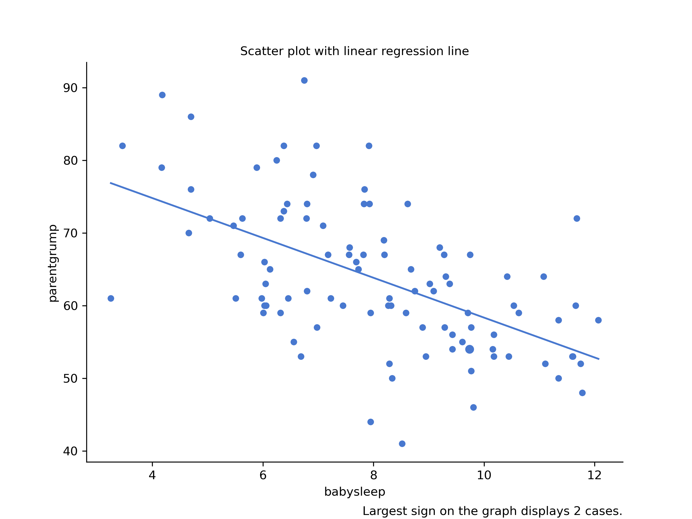
Figure 6.2: Scatterplot drawn by CogStat showing the relationship between parentsleep and parentgrump and between babysleep and parentgrump
When looking at these two plots side by side, it’s clear that the relationship is qualitatively the same in both cases: more sleep equals less grump! However, it’s also obvious that the relationship between parentsleep and parentgrump is stronger than between babysleep and parentgrump. The plot on the left is “neater” than on the right. It feels like if you want to predict the parent’s mood, it will help you a little bit to know how many hours the baby slept, but it’d be more helpful to know how many hours the parent slept.
On a scatterplot graph, each observation is represented by one dot in a coordinate system. The horizontal location of the dot plots the value of the observation on one variable, and the vertical location displays its value on the other variable.
Scatterplots are used often:
- to visualise the relationship between two variables,
- to identify trends, which can be further explored with regression analysis (see Chapter 14),
- and to detect outliers.
Scatterplots can only be used with continuous variables. If you have a discrete variable, you can use a boxplot instead.
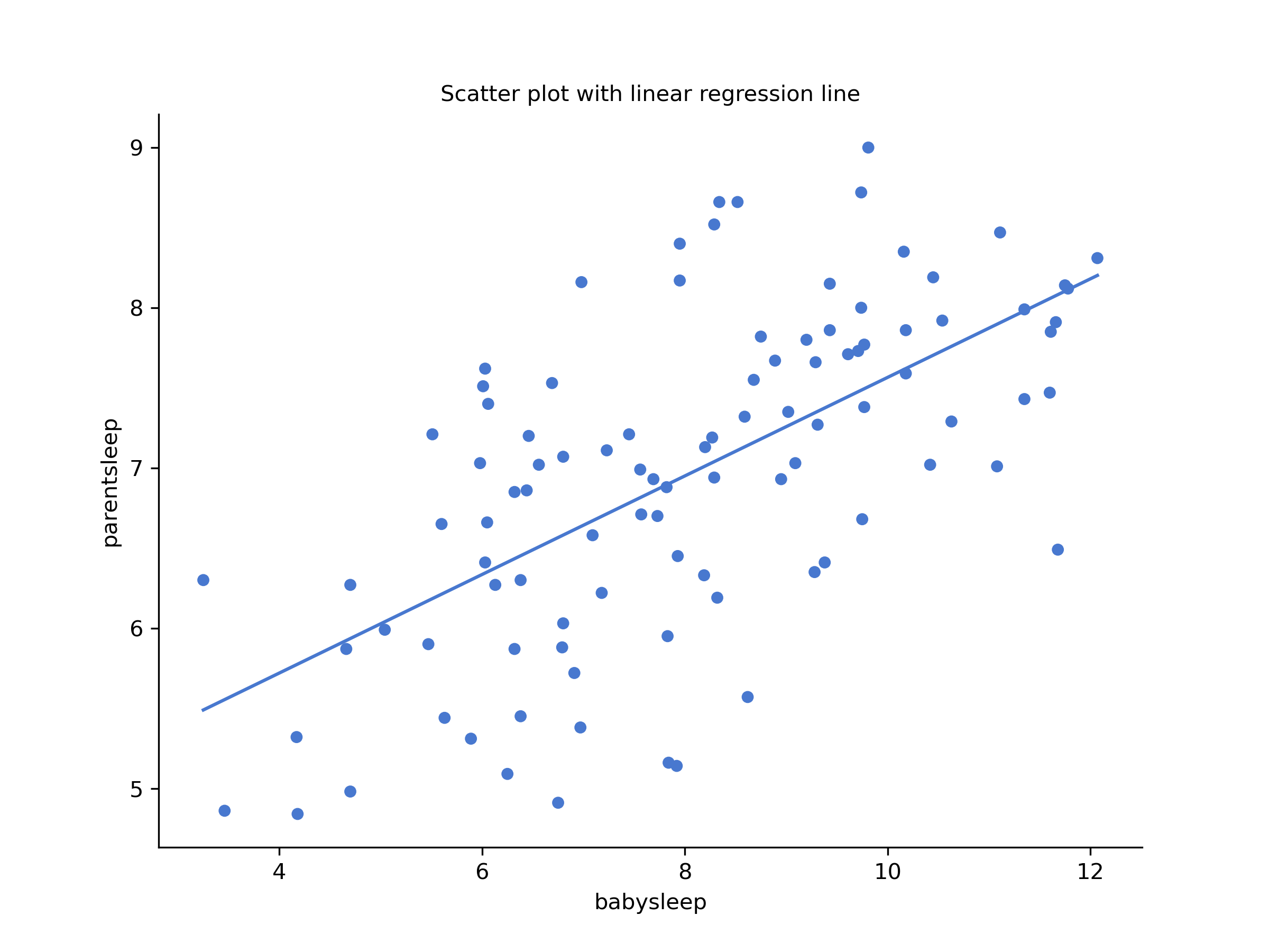
Figure 6.3: Scatterplot drawn by CogStat showing the relationship between babysleep and parentsleep
In contrast, let’s consider Figure 6.2 vs. Figure 6.3. If we compare the scatterplot of “babysleep v parentgrump” to the scatterplot of “`babysleep v parentsleep”, the overall strength of the relationship is the same, but the direction is different. If the baby sleeps more, the parent gets more sleep (positive relationship, but if the baby sleeps more, then the parent gets less grumpy (negative relationship).
6.2 The correlation coefficient
We can make these ideas a bit more explicit by introducing the idea of a correlation coefficient (or, more specifically, Pearson’s correlation coefficient), which is traditionally denoted by . The correlation coefficient between two variables and (sometimes denoted ), which we’ll define more precisely shortly, is a measure that varies from to . When , it means that we have a perfect negative relationship, and when , it means we have a perfect positive relationship. When , there’s no relationship at all. If you look at Figure 6.4, you can see several plots showing what different correlations visually look like.

Figure 6.4: Illustration of the effect of varying the strength and direction of a correlation
The Pearson’s correlation coefficient formula can be written in several ways. The simplest way to write down the formula is to break it into two steps. Firstly, let’s introduce the idea of a covariance. The covariance between two variables and is a generalisation of the notion of the variance. It is a mathematically simple way of describing the relationship between two variables that isn’t terribly informative to humans:
Because we’re multiplying (i.e., taking the “product” of) a quantity that depends on by a quantity that depends on and then averaging21, you can think of the formula for the covariance as an “average cross product” between and . The covariance has the nice property that, if and are entirely unrelated, the covariance is exactly zero. If the relationship between them is positive (in the sense shown in Figure 6.4), then the covariance is also positive. If the relationship is negative, then the covariance is also negative. In other words, the covariance captures the basic qualitative idea of correlation. Unfortunately, the raw magnitude of the covariance isn’t easy to interpret: it depends on the units in which and are expressed, and worse yet, the actual units in which the covariance is expressed are really weird. For instance, if refers to the parentsleep variable (units: hours) and refers to the parentgrump variable (units: grumps), then the units for their covariance are “hours grumps”. And I have no freaking idea what that would even mean.
The Pearson correlation coefficient fixes this interpretation problem by standardising the covariance in the same way that the -score standardises a raw score: dividing by the standard deviation. However, because we have two variables that contribute to the covariance, the standardisation only works if we divide by both standard deviations.22 In other words, the correlation between and can be written as follows: By doing this standardisation, we keep all of the nice properties of the covariance discussed earlier, and the actual values of are on a meaningful scale: implies a perfect positive relationship, and implies a perfect negative relationship.
6.3 Interpreting a correlation
Naturally, in real life, you don’t see many correlations of 1. So how should you interpret a correlation of, say ? The honest answer is that it really depends on what you want to use the data for, and on how strong the correlations in your field tend to be. A friend of Danielle’s in engineering once argued that any correlation less than is completely useless (he may have been exaggerating, even for engineering). On the other hand, there are real cases – even in psychology – where you should expect strong correlations. For instance, one of the benchmark data sets used to test theories of how people judge similarities is so clean that any theory that can’t achieve a correlation of at least isn’t deemed successful. However, when looking for (say) elementary intelligence correlates (e.g., inspection time, response time), if you get a correlation above you’re doing very well. In short, the interpretation of a correlation depends a lot on the context. That said, the rough guide in Table 6.2 is fairly typical.
| Correlation | Strength | Direction |
|---|---|---|
| -1.0 to -0.9 | Very strong | Negative |
| -0.9 to -0.7 | Strong | Negative |
| -0.7 to -0.4 | Moderate | Negative |
| -0.4 to -0.2 | Weak | Negative |
| -0.2 to 0 | Negligible | Negative |
| 0 to 0.2 | Negligible | Positive |
| 0.2 to 0.4 | Weak | Positive |
| 0.4 to 0.7 | Moderate | Positive |
| 0.7 to 0.9 | Strong | Positive |
| 0.9 to 1.0 | Very strong | Positive |
However, something that can never be stressed enough is that you should always look at the scatterplot before attaching any interpretation to the data. A correlation might not mean what you think it means. The classic illustration of this is “Anscombe’s Quartet” (Anscombe, 1973), which is a collection of four data sets. Each data set has two variables, an and a . For all four data sets, the mean value for is 9, and the mean for is 7.5. The standard deviations for all variables are almost identical, as are the standard deviations for the variables. And in each case the correlation between and is .
You’d think that these four data sets would look pretty similar to one another. They do not. If we draw scatterplots of against for all four variables, as shown in Figure 6.5 we see that all four of these are spectacularly different to each other.

Figure 6.5: Anscombe’s quartet. All four of these data sets have a Pearson correlation of , but they are qualitatively different from one another.
The lesson here, which so very many people seem to forget in real life, is “always graph your raw data”.
6.4 Spearman’s rank correlations

Figure 6.6: The relationship between hours worked and grade received for a toy data set consisting of only 10 students (each circle corresponds to one student). The dashed line through the middle shows the linear relationship between the two variables. This produces a strong Pearson correlation of . However, the interesting thing to note here is that there’s actually a perfect monotonic relationship between the two variables: in this toy example, at least, increasing the hours worked always increases the grade received, as illustrated by the solid line. This is reflected in a Spearman correlation of . With such a small data set, however, it’s an open question as to which version better describes the actual relationship involved.
The Pearson correlation coefficient is useful for many things, but it has shortcomings. One particular issue stands out: what it actually measures is the strength of the linear relationship between two variables. In other words, it gives you a measure of the extent to which the data all tend to fall on a single, perfectly straight line. Often, this is a pretty good approximation to what we mean when we say “relationship”, and so the Pearson correlation is a good thing to calculate. Sometimes, it isn’t.
One very common situation where the Pearson correlation isn’t quite the right thing to use arises when an increase in one variable really is reflected in an increase in another variable . However, the nature of the relationship isn’t necessarily linear. An example of this might be the relationship between effort and reward when studying for an exam. If you put zero effort () into learning a subject, you should expect a grade of 0% (). However, a little bit of effort will cause a massive improvement: just turning up to lectures means that you learn a fair bit and if you just turn up to classes and scribble a few things down so your grade might rise to 35%, all without a lot of effort. However, you just don’t get the same effect at the other end of the scale. As everyone knows, it takes a lot more effort to get a grade of 90% than it takes to get a grade of 55%. This means that if I’ve got data looking at study effort and grades, there’s a good chance that Pearson correlations will be misleading.
To illustrate, consider the data plotted in Figure 6.6, showing the relationship between hours worked and grade received for 10 students taking some classes. The curious thing about this – highly fictitious – data set is that increasing your effort always increases your grade. It might be by a lot or by a little, but increasing the effort will never decrease your grade.
The data are stored in effort.csv. CogStat will calculate a standard Pearson correlation first23. It shows a strong relationship between hours worked and grade received: . But this doesn’t actually capture the observation that increasing hours worked always increases the grade. There’s a sense here in which we want to say that the correlation is perfect but for a somewhat different notion of a “relationship”. What we’re looking for is something that captures the fact that there is a perfect ordinal relationship here. That is, if student 1 works more hours than student 2, then we can guarantee that student 1 will get a better grade. That’s not what a correlation of says at all.
How should we address this? Actually, it’s really easy: if we’re looking for ordinal relationships, all we have to do is treat the data as if it were an ordinal scale! So, instead of measuring effort in terms of “hours worked”, let us rank all 10 of our students in order of hours worked. That is, student 1 did the least work out of anyone (2 hours), so they got the lowest rank (rank = 1). Student 4 was the next laziest, putting in only 6 hours of work over the whole semester, so they got the next lowest rank (rank = 2). Notice that we’re using “rank = 1” to mean “low rank”. Sometimes in everyday language, we talk about “rank = 1” to mean “top rank” rather than “bottom rank”. So be careful: you can rank “from smallest value to largest value” (i.e., small equals rank 1), or you can rank “from largest value to smallest value” (i.e., large equals rank 1). In this case, we’re ranking from smallest to largest. But in real life, it’s really easy to forget which way you set things up, so you have to put a bit of effort into remembering!
Okay, so let’s have a look at our students when we rank them from worst to best in terms of effort and reward:
| Student | Rank (hours worked) | Rank (grade received) |
|---|---|---|
| student 1 | 1 | 1 |
| student 2 | 10 | 10 |
| student 3 | 6 | 6 |
| student 4 | 2 | 2 |
| student 5 | 3 | 3 |
| student 6 | 5 | 5 |
| student 7 | 4 | 4 |
| student 8 | 8 | 8 |
| student 9 | 7 | 7 |
| student 10 | 9 | 9 |
Hm. These are identical. The student who put in the most effort got the best grade, the student with the least effort got the worst grade, etc. We can rank students by hours worked, then rank students by grade received, and these two rankings would be identical. So if we now correlate them, we get a perfect relationship: .
We’ve just re-invented the Spearman’s rank order correlation, usually denoted (pronounced: rho) to distinguish it from the Pearson correlation . CogStat will use to denote rank order correlation.
CogStat will automatically calculate both Pearson’s correlation and Spearman’s rank order correlation for you if your measurement is not set in your source data (Figure 6.7). If you set the measurement type to “ordinal” in your source file, it will omit to calculate Pearson’s correlation due to the above reasons.
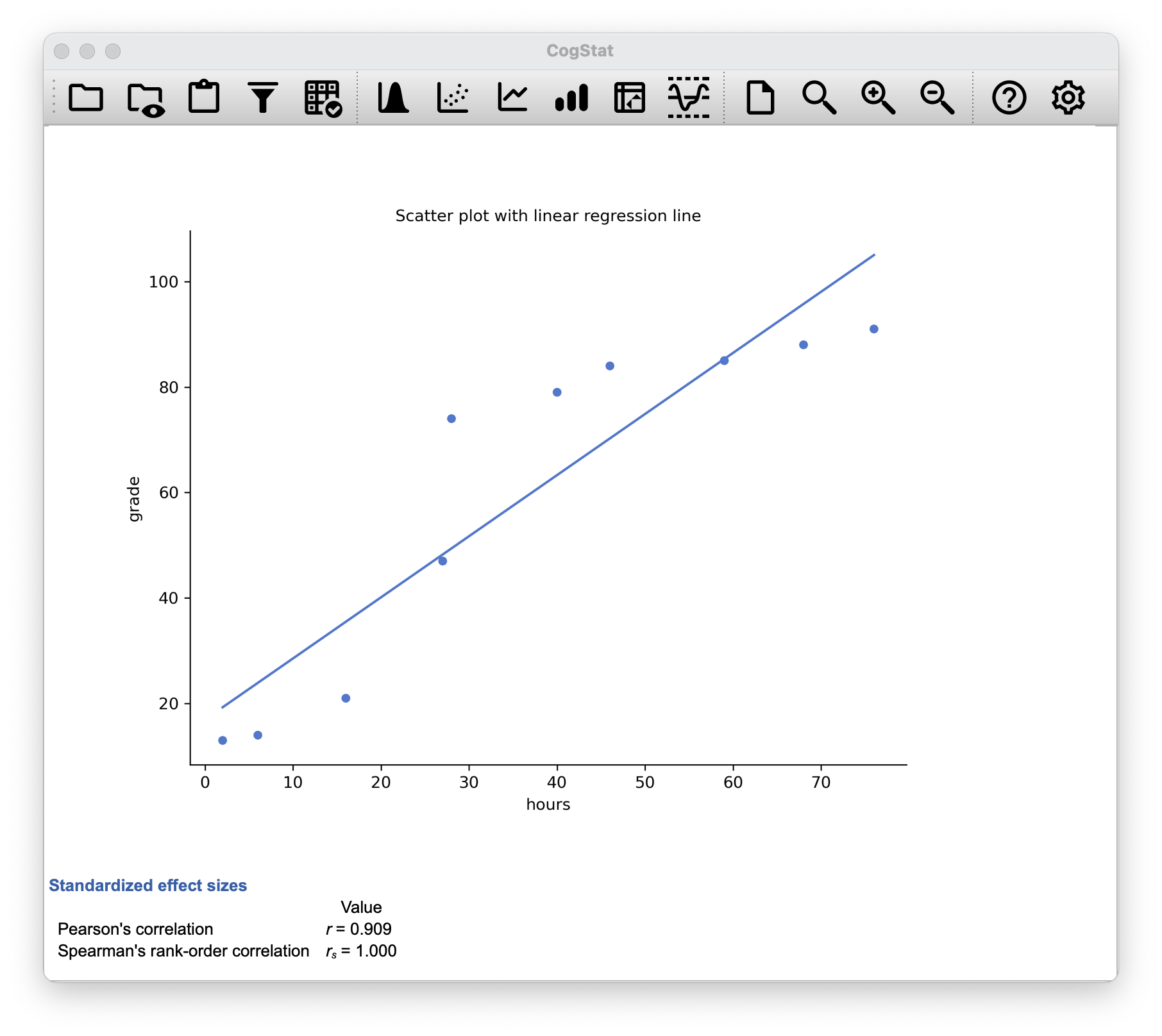
Figure 6.7: This is what you would see in CogStat after loading the effort.csv dataset.
6.5 Missing values in pairwise calculations
To illustrate the issues, let’s open up a data set with missing values, parenthood_missing.csv. This file contains the same data as the original parenthood data but with some values deleted. While the original source could contain an empty value or NA, CogStat will display NaN for these missing values (Figure 6.8).
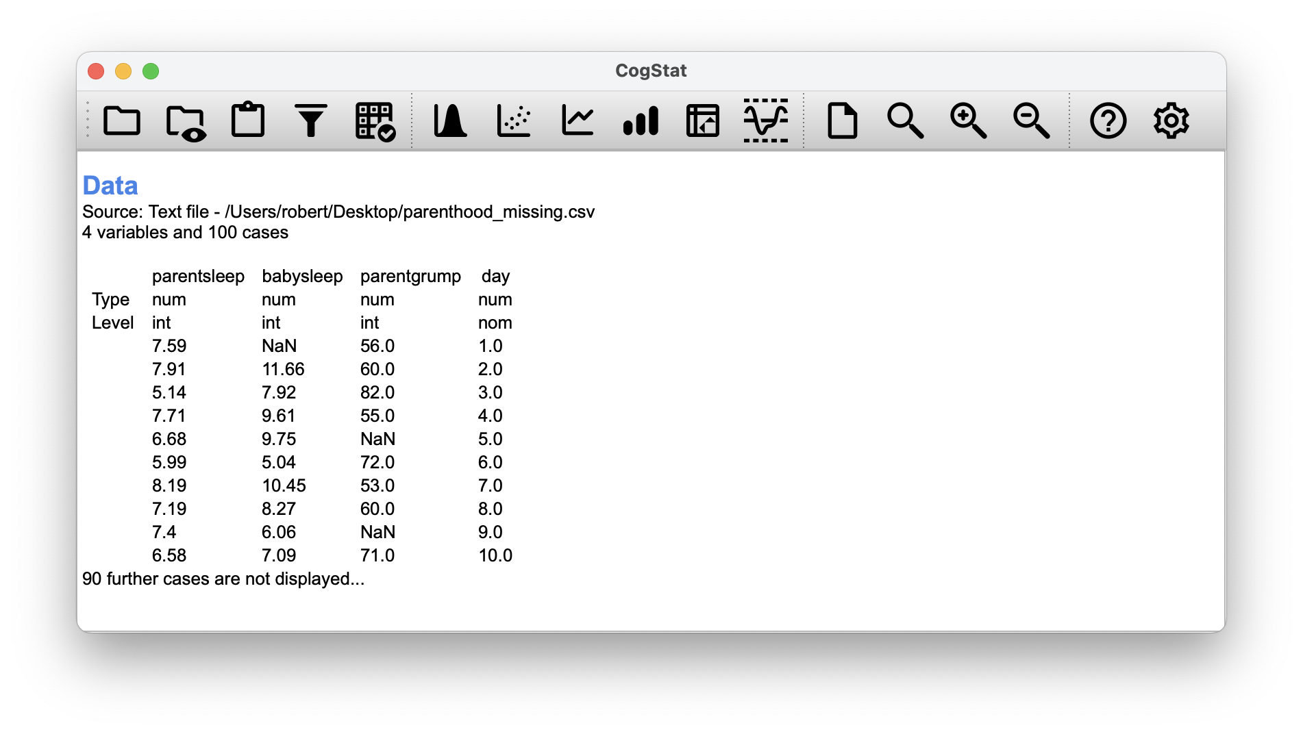
Figure 6.8: This is what you would see in CogStat after loading the adjusted dataset.
Let’s calculate descriptive statistics using the Explore variable function (See Chapter: 5):
parentgrump
|
parentsleep
|
babysleep
|
|
|---|---|---|---|
| Mean | 63.2 | 6.977 | 8.114 |
| Standard deviation | 9.8 | 1.015 | 2.035 |
| Skewness | 0.4 | -0.346 | -0.096 |
| Kurtosis | -0.2 | -0.647 | -0.5 |
| Range | 48 | 4.16 | 8.82 |
| Maximum | 89 | 9 | 12.07 |
| Upper quartile | 70.2 | 7.785 | 9.61 |
| Median | 61 | 7.03 | 8.2 |
| Lower quartile | 56 | 6.285 | 6.46 |
| Minimum | 41 | 4.84 | 3.25 |
We can see that there are 9 missing values for parentsleep (N of missing cases: 9), 11 missing values for babysleep (N of missing cases: 11), and 8 missing values for parentgrump (N of missing cases: 8).
Whichever pair you’d like to run (e.g., parentsleep vs. parentgrump), CogStat will automatically exclude the missing values from the calculation:
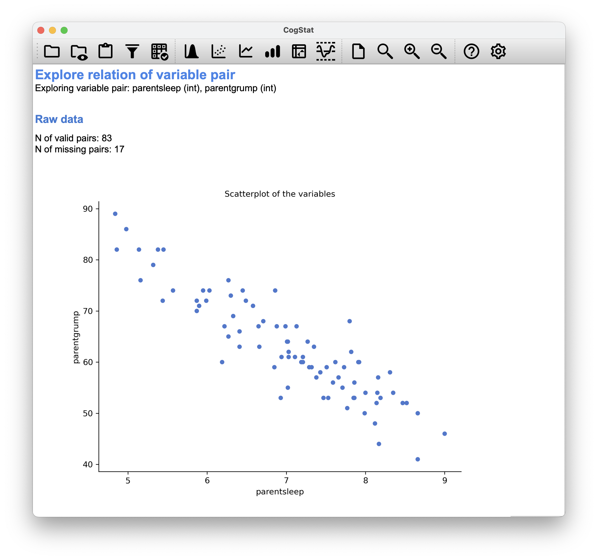
Figure 6.9: 17 missing pairs when comparing parentsleep and parentgrump
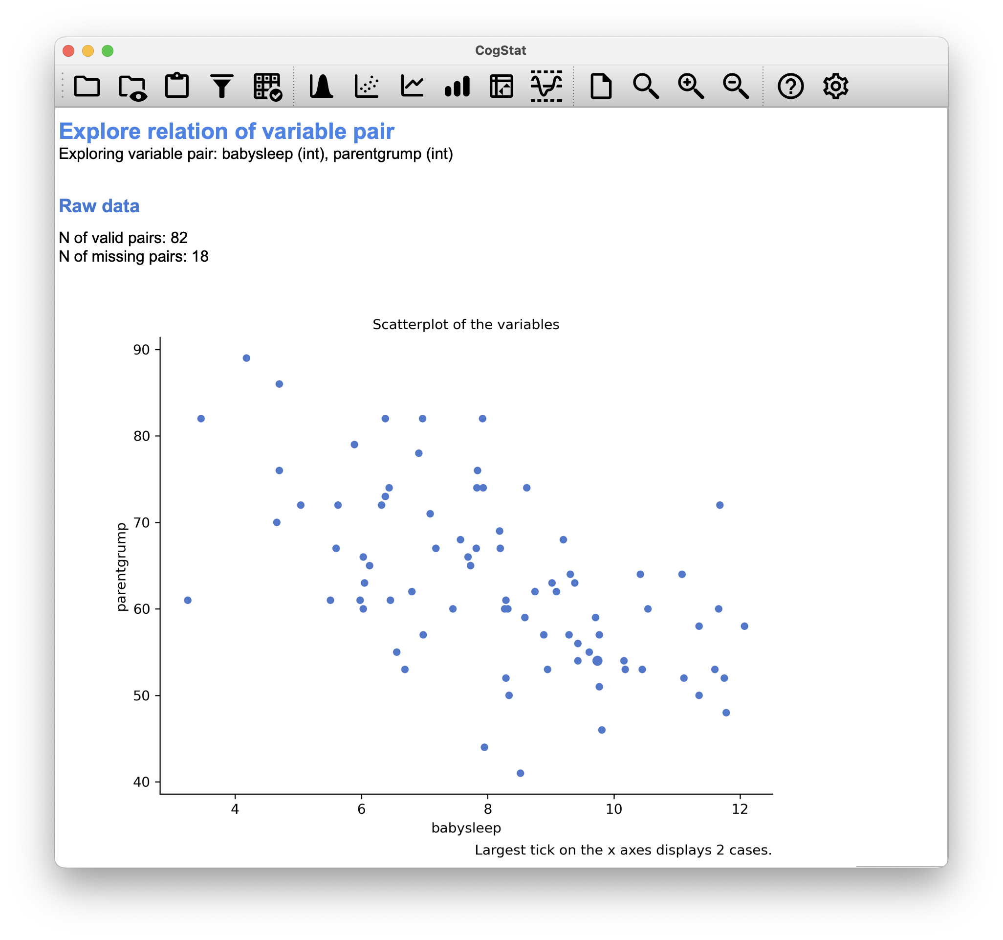
Figure 6.10: 18 missing pairs when comparing babysleep and parentgrump
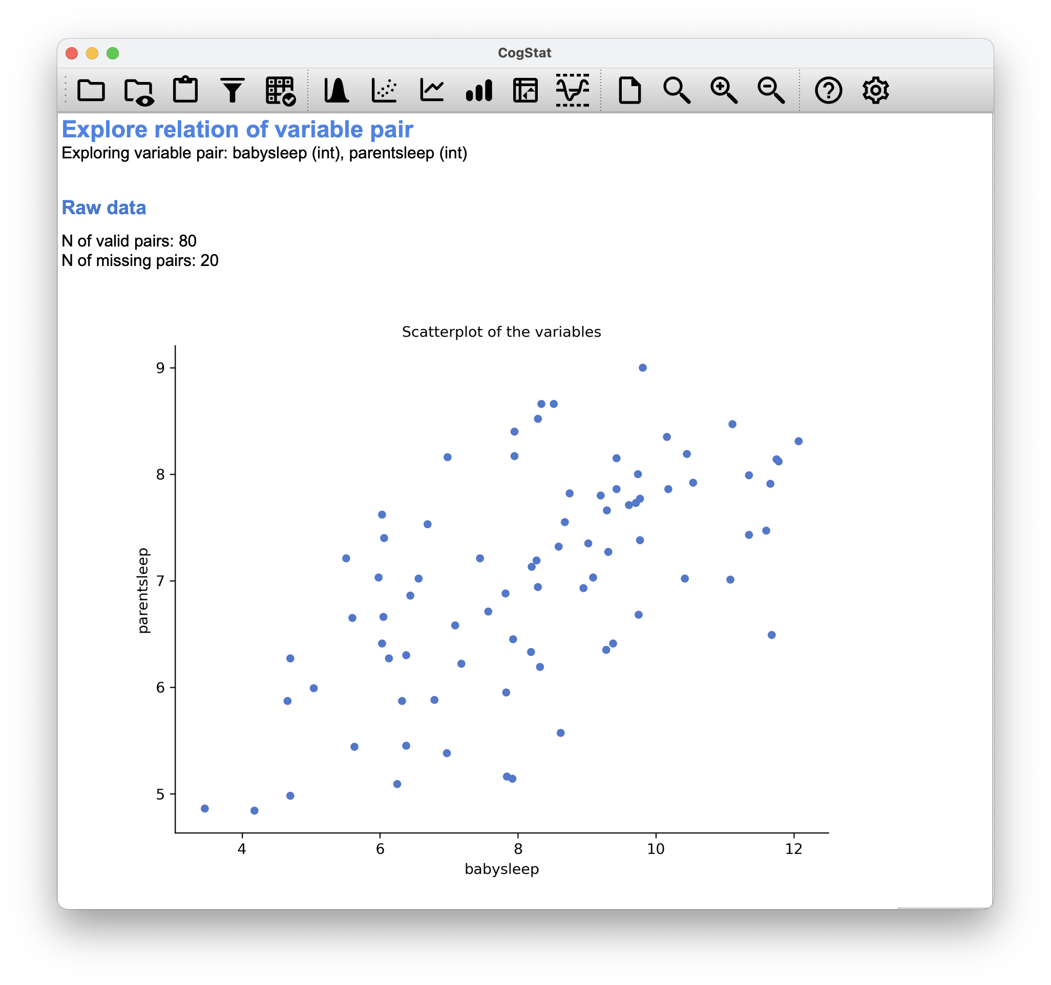
Figure 6.11: 20 missing pairs when comparing babysleep and parentsleep
Summary
In this chapter, we discussed how to measure the strength of the relationship between two variables. We introduced the concept of correlation and how to calculate it using CogStat. We also discussed the difference between Pearson’s correlation (Chapter 6.2) and Spearman’s rank order correlation (Chapter 6.4), and how CogStat will calculate it for you. Finally, we discussed how CogStat handles missing values (Chapter 6.5) in pairwise calculations.
You might have been tempted to look at the regression coefficient, the linear regression formula etc. when exploring the results from CogStat. Don’t worry, you’ll have a chance to learn about these in Chapter 14.
References
Just like we saw with the variance and the standard deviation, in practice, we divide by rather than .↩︎
This is an oversimplification.↩︎
Unless, of course, you set your measurement level in the second row of the CSV as
"ord"(ordinal), because then you already tell the software that Pearson’s does not make sense to look at.↩︎